Beautiful Bibles
It all began as a simple idea: Publish beautiful Bibles. Easy to say; profoundly hard to do. And many have overlooked the aesthetic cornerstone of a beautiful Bible – the typeface. That one choice – the typeface – determines whether the biblical text published will be readable, portable, and aesthetically pleasing. And if completely unique typefaces were to be created for different translations of the Bible, new opportunities would present themselves to align the typeface with the history and aspirations of the translation as well as the heritage and values of those who love each translation.
Delight is in the details
Stepping inside a grand cathedral lifts the spirit heavenward for reasons difficult to decode. No single architectural or artistic element defines the experience; rather, it is the curated collection that draws us in and then elevates our hearts. We don’t have to explain it; we can simply feel it. That’s the beautiful mystery of sacred space. The physical engages the emotions and opens the spirit. A thoughtfully crafted physical Bible can function the same way, inviting readers into an experience with God’s inspired, revealed, and preserved words. The text remains the focus of the Bible, but its presentation can elevate the experience. At least that is the aspiration of Bible publishers.
Cathedrals are designed to engage and lift the spirits of those who encounter and enter them. The artisan labouring near the highest reaches of the ceiling often did thoughtful and exacting work that visitors would never notice. Many of the figures were sculpted centuries before the invention of the telescope, not to mention the telephoto lens, so the faithful had no way of noticing the articulated edges of a book’s pages or the subtle creases in the face of an apostle. But the artist knew, and his attention to detail was an act of consecrated imagination and integrity.
So, too, is the design of minute details in typeface. Millions of “visitors” to Comfort Print Bibles have been unaware of the innovations and adjustments that distinguish the various typefaces. But the artisans know. And when Bible publishing is concerned, the point is not to indulge or celebrate the designers’ idiosyncrasies and expressive preferences, but rather to transport the reader directly to the heart of the matter, the Holy Word of God.
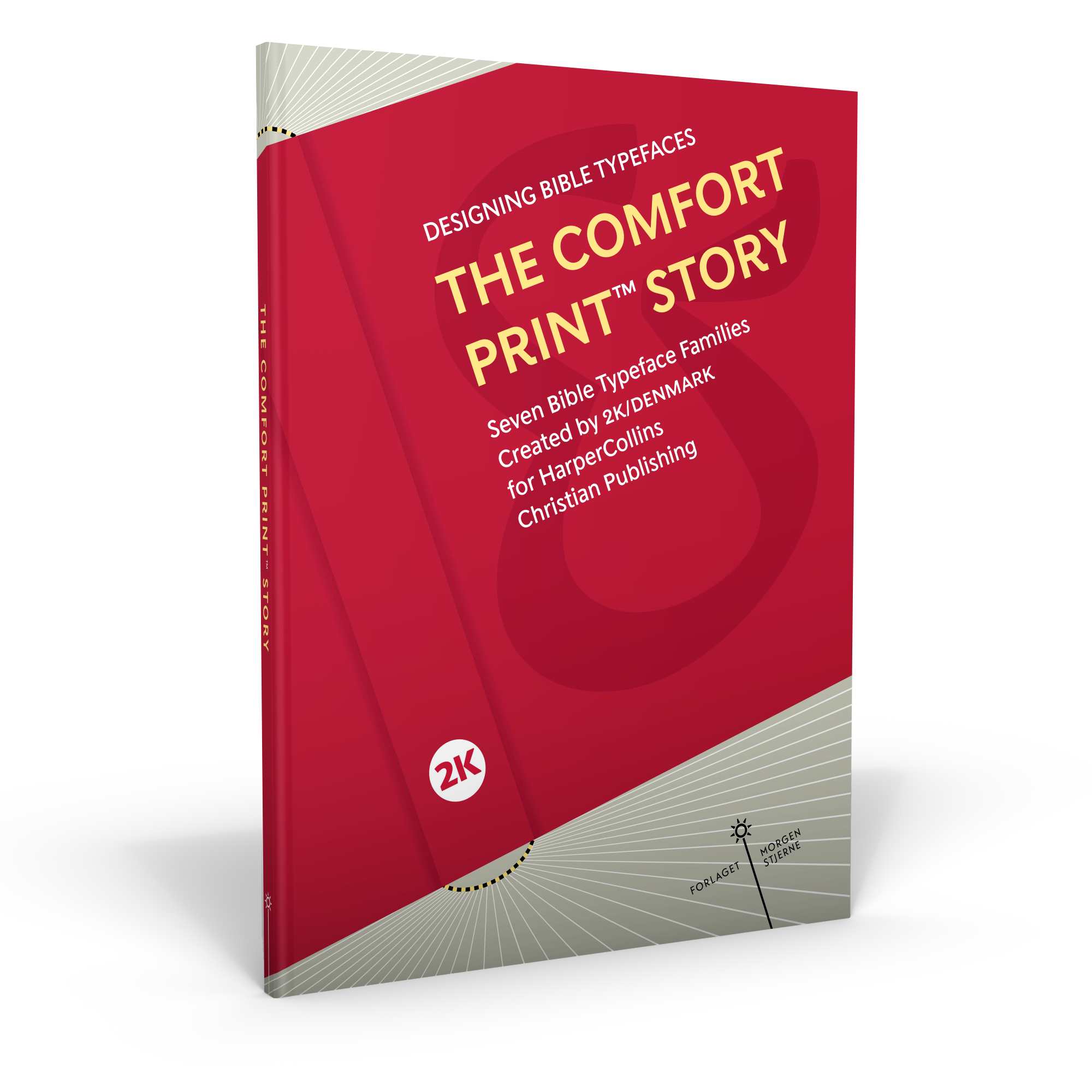
The Comfort Print™ Story gives readers a glimpse at the assiduous activity that lies behind what appears on the page. The typefaces are artful and effectual, but they are also testimonies to the ingenuity and vitality of a largely-invisible guild at work on your behalf.
Read about the inspirational background for each of the seven typeface families and their translations, the design process, and the innovative advances in type design. See the presentation of the 56 fonts in use; on art posters and on innovative new Bible designs. This is a tribute to everyone who has toiled to realise the vision, and by joined efforts reached the completion of this great task.


 No products in the cart.